suppressPackageStartupMessages({
    library(tidyverse)
    library(cowplot)
    library(ggrepel)
    library(pheatmap)
})
theme_set(theme_cowplot())
options(repr.plot.width=9,repr.plot.height=7)
PCA visualization in R
This guide illustrates how to visualize the results of a PCA analysis
There is a sister notebook to this one in Python here: PCA visualization in Python
Dataset
# iris dataset is part of R base
head(iris,5)
Loading...
Run a PCA decomposition
iris.data = select(iris, -Species)
pca_res = prcomp(iris.data)
dim(pca_res$x)
Loading...
Scatter plot of observations
Observations are projected on the first 2 components
pca_res$x %>%
bind_cols(select(iris, Species)) %>%
ggplot(aes(x=PC1, y=PC2, color=Species)) + geom_point(size=3)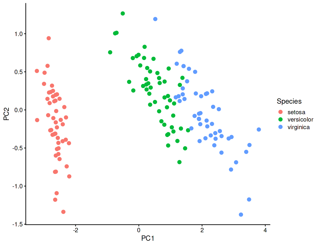
Explained variance (eigenvalues)
The amount of variance explained by each of the components
var = pca_res$sdev ** 2
var
Loading...
tibble(var_percent=100*var/sum(var),pc=colnames(pca_res$x)) %>%
ggplot(aes(x=pc, y=var_percent)) +
geom_col() +
geom_label(aes(label=round(var_percent,1)))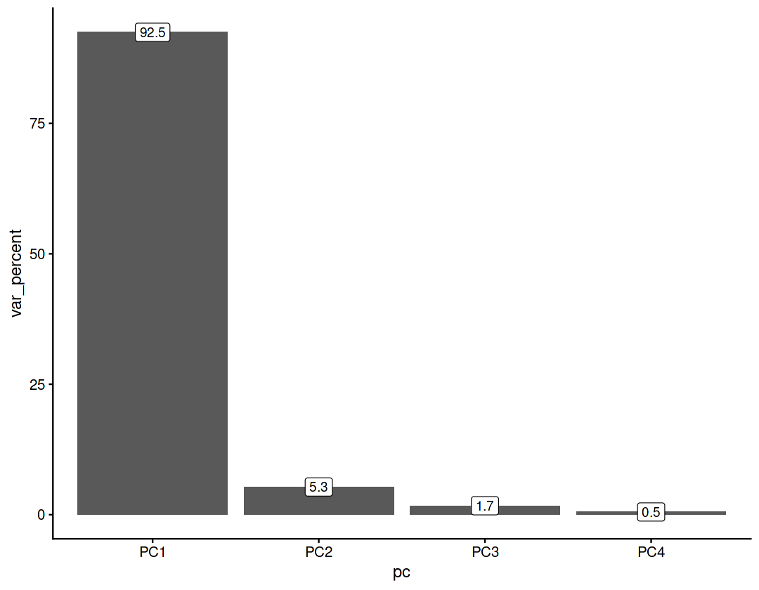
Cumulative variance
tibble(var_percent=100*var/sum(var),pc=colnames(pca_res$x)) %>%
mutate(cumulative_var=cumsum(var_percent)) %>%
ggplot(aes(x=pc, y=cumulative_var,group=1)) +
geom_point(size=3) +
geom_line()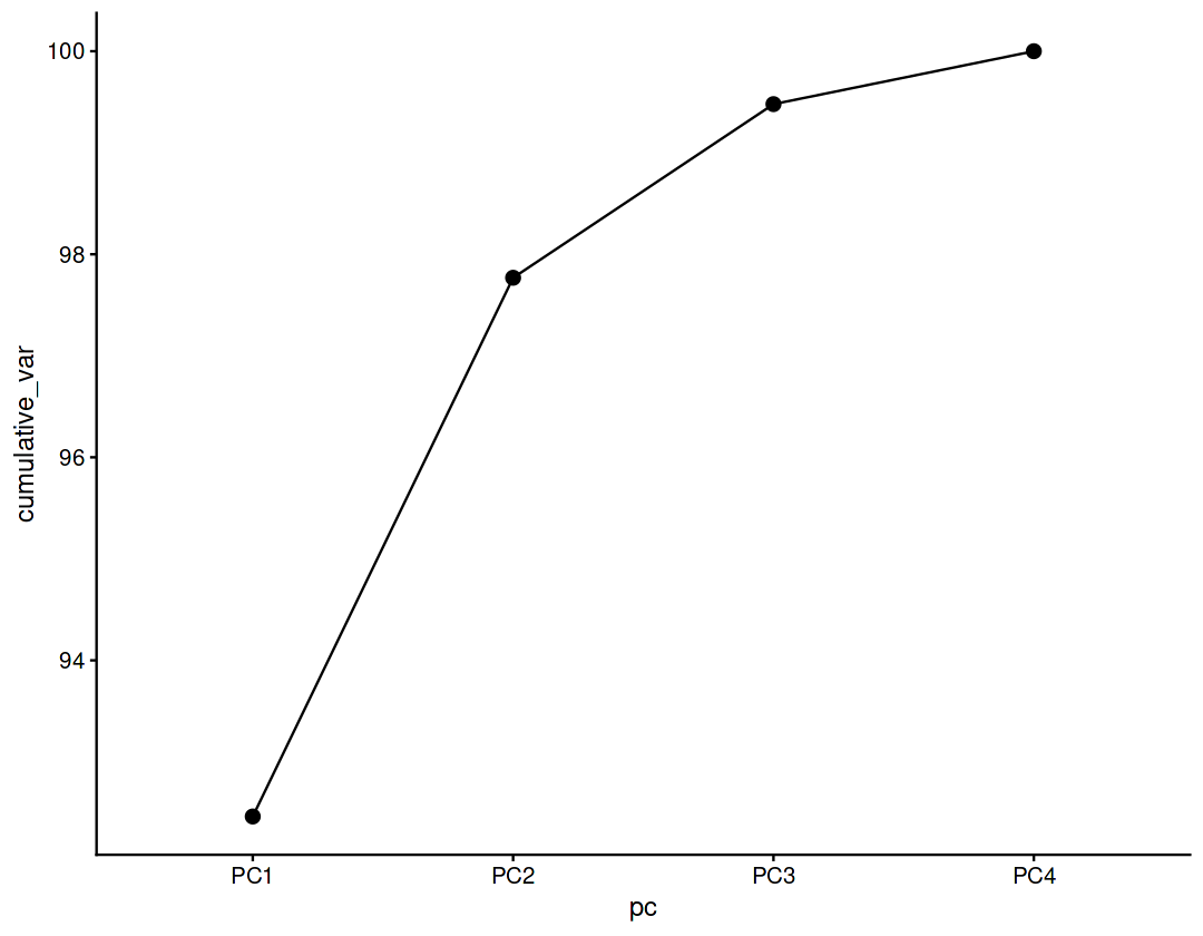
Component rotations (eigenvectors)
Principal axes in feature space, representing the directions of maximum variance in the data
pca_res$rotationLoading...
pca_res$rotation %>%
as.data.frame() %>%
rownames_to_column('variable') %>%
pivot_longer(names_to = 'pc', values_to = 'value', -variable) %>%
ggplot(aes(y=variable, x=value)) + geom_col() + facet_wrap(~pc)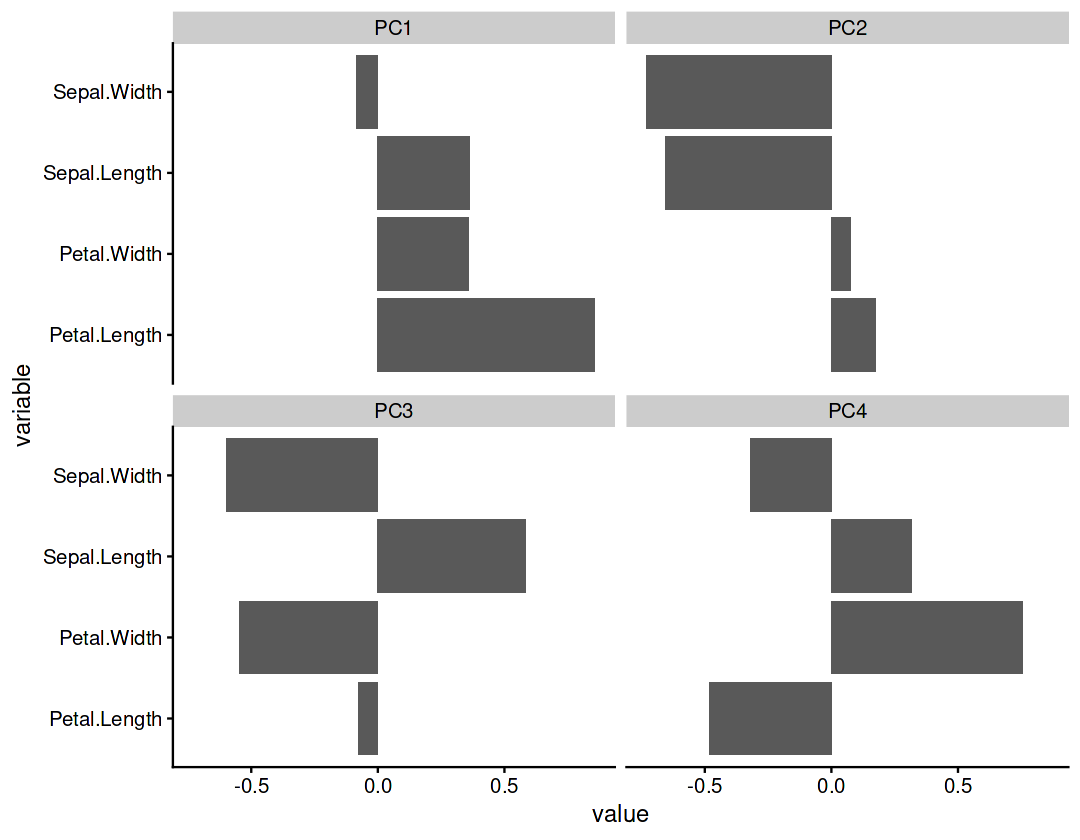
Component loadings
Eigenvectors scaled by the square root of the eigenvalues
var_cor = t(pca_res$rotation) * pca_res$sdev
var_cor
Loading...
m = max(abs(var_cor))
t(var_cor) %>%
as.data.frame() %>%
rownames_to_column('var') %>%
ggplot(aes(x=PC1, y=PC2)) +
geom_segment(arrow=arrow(),aes(x=0,y=0,xend=PC1,yend=PC2)) +
geom_vline(xintercept=0, linetype=2) +
geom_hline(yintercept=0, linetype=2) +
geom_label_repel(aes(label=var),box.padding = 1, min.segment.length = Inf)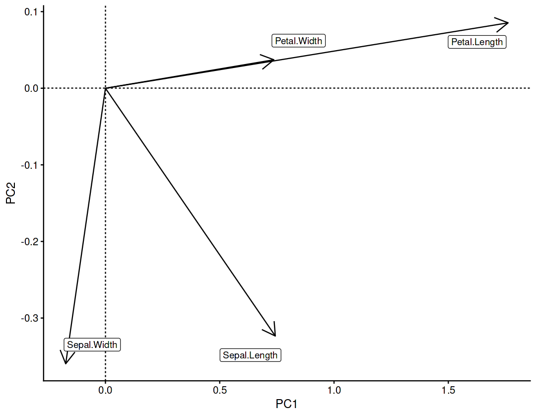
Component contributions
Measures the contribution of the variables to each component
var_cos2 = var_cor ** 2
var_contrib = (100 * var_cos2) / rowSums(var_cos2)
var_contrib
Loading...
var_contrib %>%
as.data.frame() %>%
rownames_to_column('pc') %>%
pivot_longer(names_to = 'var', values_to = 'contrib_percent', -pc) %>%
ggplot(aes(y=var, x=contrib_percent)) + geom_col() + facet_wrap(~pc)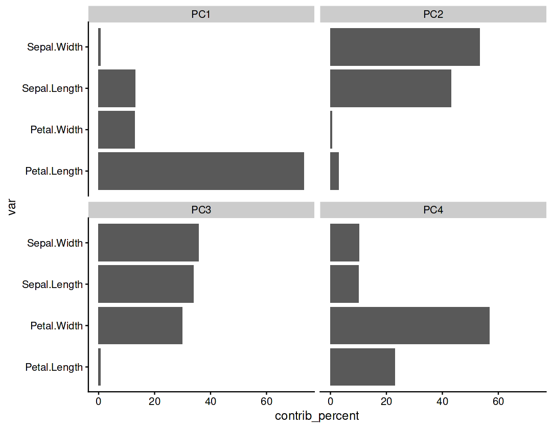
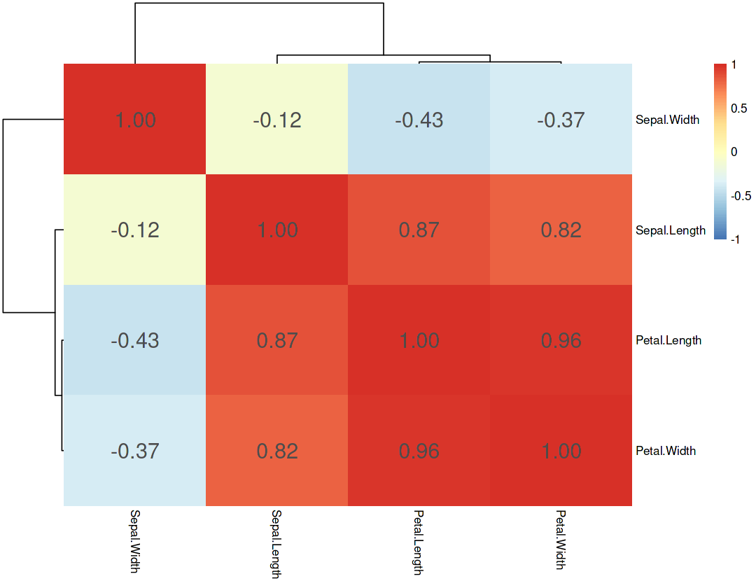
Correlation of all variables
Compare the correlations with the components loadings found by PCA
cor(iris.data) %>%
pheatmap(display_numbers = TRUE, border_color = NA, fontsize_number = 18, breaks = seq(-1,1,length.out = 101))